Case Study
Brokkoli
More than just a vegan HelloFresh alternative
Vegan is that easy
"The slogan describes it very well. The idea of broccoli and the implementation are great. At last I no longer have to waste time looking for recipes and going shopping, but can simply eat tasty and healthy food. As the company is still in its infancy, not all the features I want are available yet, but knowing the team, they will surprise us quickly and regularly with new features to make cooking and my healthy vegan diet even easier. Thank you Broccoli. Keep up the good work! 🙏🏻"
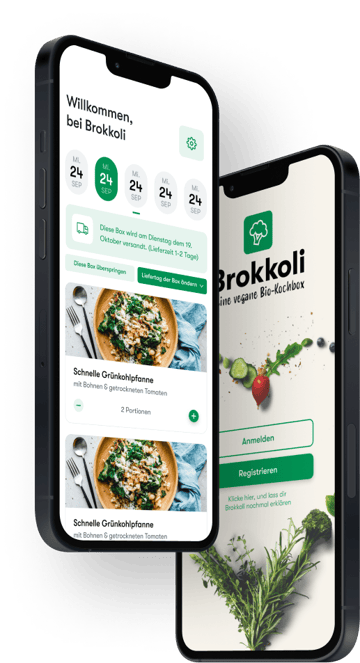
Brokkoli is a vegan cooking box developed by us to maximize the positive impact on the world and offer a sustainable alternative to conventional cooking boxes. Through a progressive 'learning by doing' approach, we were able to quickly implement a prototype and develop further features based on customer feedback. The focus was on organic food and the long-term vision of creating a smart and sustainable online supermarket.
Industry
Food, B2C
Service
Mobile App
Technology
Flutter
.NET Core
Azure
Chargebee
Auth0
GraphCMS
Retool
Figma
History of origin
At the beginning of 2021, CodingPassion came up with the idea of developing its own product in addition to the service. As a company that attaches great importance to sustainability, our idea was to maximize our positive impact in the world. After much deliberation, the decision was made to create a vegan cooking box with exclusively organic food. There are already many cooking boxes such as HelloFresh, MarleySpoon and co. on the market, but a purely organic vegan alternative did not yet exist at that time. The moment also seemed right to us, as the demand for vegan food in Germany was higher than ever before.
The big vision behind Brokkoli was more than just a simple cooking box. The plan was to create a smart and sustainable online supermarket that would enable people who don't live in big cities to conveniently and easily access a range of products similar to those found at Alnatura or Bio Denns.
"Well, I have to say, I'm really excited about broccoli! The idea of a sustainable, vegan cooking box with exclusively organic food appealed to me right from the start. And when I ordered for the first time and received the box, I was simply thrilled. The selection of recipes was great and I really discovered a lot of new dishes that I hadn't tried before. I was also really impressed by the quality of the food - everything was fresh and of the best quality.
But it wasn't just cooking with broccoli that I enjoyed, but also the app itself. It's super easy to use and I was able to manage my subscription and recipes with just a few clicks. And when I had a question, the customer service was quick and friendly to help me out. I'm definitely a big fan and can only recommend Brokkoli to anyone looking for a sustainable, vegan cooking box!"
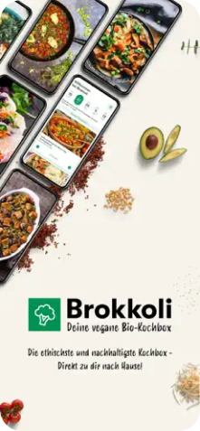
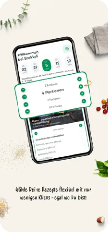
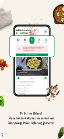
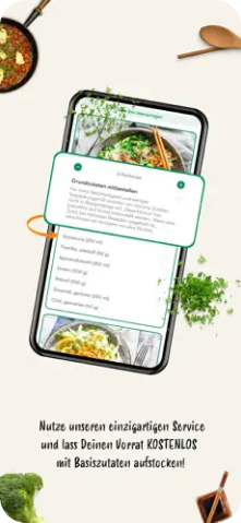
The first prototype
Since our expertise was not in the food industry, but in software, we decided to build Brokkoli progressively - according to the "learning by doing" approach. This gave us a lot of advantages. On the one hand, we were able to launch our app with a minimal number of features in the app and play stores and then develop further features directly with the help of customer feedback. Since we didn't yet know exactly what our customers valued most, this approach meant we didn't have to build an extensive app based solely on assumptions.
(In fact, the app's first MVP was built and released in less than 5 days during a hackathon). Other benefits included reduced risk and lower costs if the product turned out to be unviable or unworkable for us.
We launched the first prototype with just the following features:
- Customer onboarding
- Selection of recipes and portion sizes (5 per week)
- Weekly delivery of ingredients for the recipes
- Account settings for the subscription
Our main customers in this iteration consisted of friends, family and a few interested parties from our first email campaign.
As expected - and intended - we made many mistakes in this initial phase, from which we learned and were able to create a better product at the end of the day. Thanks in particular to the close contact with our customers, it was easy to quickly identify problems and integrate suggestions for improvement into the logistics and shipping process and the app.
With the help of this principle, we have not only improved Brokkoli in the initial phase, but continuously.
845
TorqueBoxes shipped
4764
Portions eaten
100%
Organic vegan
Feedback, Feedback, Feedback
Valuable customer feedback can be collected in different ways. Active feedback through app and playstore reviews, support emails, etc. can be helpful, but is usually not nearly enough. In order to offer a perfect product, we need feedback on the recipes, the delivery, the quality of the food, the user-friendliness of the app, input on new features, etc ...
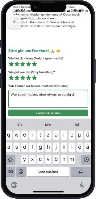
In order to achieve exactly that, in addition to user interviews and UX tests, we also focused on getting quick feedback within the app. For example, there is a feedback section under each recipe in the app where customers can rate the taste and recipe instructions. This was extremely helpful in sorting out dishes that were not popular and continuously improving the instructions.
Another example is that customers gave us feedback about late deliveries, bad or missing food via email. This was cumbersome for both us and our users. So we simplified the process and gave users the option to easily report problems with the Kochbox within the app. To make the process even easier for everyone, we provided a pre-defined selection of problems that occurred very frequently, such as "problem with the delivery", "quality of the food", "missing food", etc.
Ingenious UX through user interviews
When creating large features, such as the integration of our online supermarket system, we relied on UX tests in user interviews before implementation. We had our customers navigate through a click dummy and observed where they had problems and where there was potential for improvement. This was also particularly helpful in validating our hypotheses in the app design.
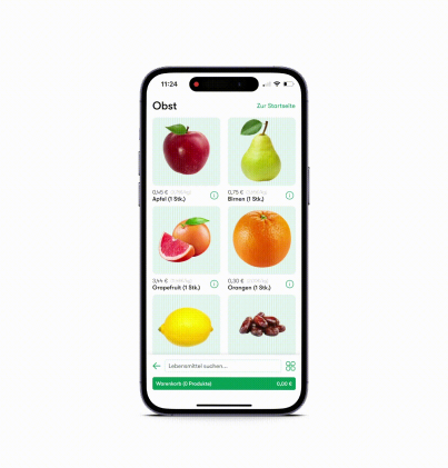
For example, as users scrolled through our supermarket, we noticed that the top elements were difficult to reach with the thumb. We came up with an unusual, creative solution, but we first had to investigate whether users understood it straight away. (As it turned out, our hypothesis was correct and our customers understood the unusual UI component and accepted it without any problems.
Another obvious example is the timer function integrated into the app. When re-cooking recipes, we noticed that users often switched between their own timer app and the broccoli app when a cooking timer was needed, e.g. for spaghetti. Especially if their own stove did not have a timer function. Interestingly, this function was also missing in other cooking box apps. However, we added the timer within 2 weeks and improved the cooking experience.
Other changes we made to the app after we noticed them in UX tests were:
- Always-on screen: If users did not touch their smartphone for a longer period of time while cooking the recipes, the screen would usually switch off and then interfere with cooking. So we simply prevented the screen from going off while cooking. We didn't find this simple feature in other cooking box apps either.
- Supermarket search bar: Most people who don't use an iPhone are probably used to having the search bar (e.g. in the browser) at the top of the screen. But strictly speaking, this makes little sense because it is almost impossible to reach it easily with your thumb. So, just like Apple, we decided to place the search bar at the bottom of the screen.
- Trial box feature: It was important to us to first convince customers of the quality of the product and then let them decide for themselves whether they would like to continue receiving the vegan cooking box. As we always needed a week's lead time to prepare the next week's orders, new customers sometimes automatically ordered the second week's cooking box before they could try out their first box. We solved this problem quite simply by designating the first cooking box as a "trial box" and automatically skipping the second week's cooking box (unless the customer explicitly ordered this).
In addition to the user-friendliness aspect, we also found numerous features that our customers wanted. A good example of this is the nutritional information for the recipes. In interviews with our target group, we repeatedly noticed that they attached great importance to a healthy, balanced diet or followed special diets in which nutritional values played an important role. As it involved a certain amount of effort to meticulously calculate the nutritional values for each recipe, we initially decided against including this feature. But after so many user interviews showed how important it was to our customers, we finally implemented it.
Data-Driven Decision Making
One pain point we had was the low conversion rate in our onboarding process. However, it was not 100% clear to us what was causing this, as too many factors could play a role (e.g. Kochbox price, complicated pricing model, onboarding UI, delivery information, billing, etc.). We set ourselves the KPI of increasing the conversion rate by at least 30%.
One pain point we had was the low conversion rate in our onboarding process. However, it was not 100% clear to us what was causing this, as too many factors could play a role (e.g. Kochbox price, complicated pricing model, onboarding UI, delivery information, billing, etc.). We set ourselves the KPI of increasing the conversion rate by at least 30%.

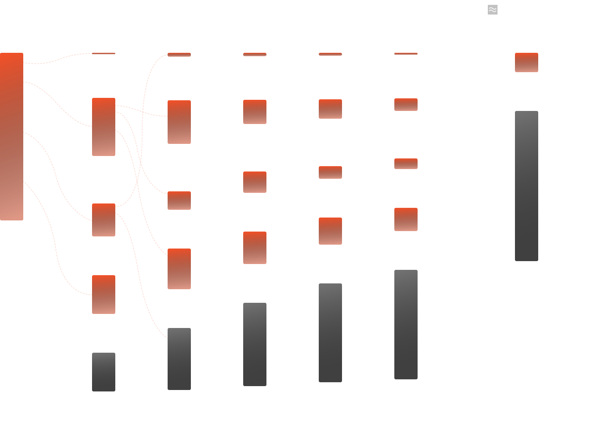
For example, the original onboarding process had 4 consecutive steps with their own screens. On the first screen, users could select the recipes (and number of recipes) for the first week. In step 2, they could then select the corresponding number of portions, where the corresponding price was also displayed. Using user flow diagrams, we found that there was a certain bounce rate at this point, which was higher than expected. Our assumption was that it was easier for users to understand if we displayed the recipe and portion selection on one screen and we adapted the app accordingly. We also found in user interviews that users still lacked a lot of context about broccoli. We decided to also play a short explanatory video at the beginning of the app, which clarified all the frequently asked questions, and the end result was that we achieved our goal of increasing the conversion rate by 30%, which would probably not have been possible without the relevant data.
Cost reduction through the use of generic third-party software
In the IT industry, you often see developers trying to reinvent the wheel. This means that generic functionalities such as user authentication and a corresponding login page are often developed in-house, even though there are already mature SaaS products for precisely this purpose. Purchasing such software products usually saves a lot of time and money and allows you to concentrate on the really important business cases.
As an extreme example, we at Brokkoli used Auth0, a service for authentication and authorization, instead of developing the functionality ourselves or integrating it via open source projects such as Keycloak (which would mean additional maintenance effort). Auth0 gave us an out-of-the-box, easy-to-configure web-based login page where users could register and log in. The development effort on our side, without Auth0, would probably have been 10-15 days. The service, on the other hand, didn't cost us a cent, as the free plan was perfectly adequate to start with.
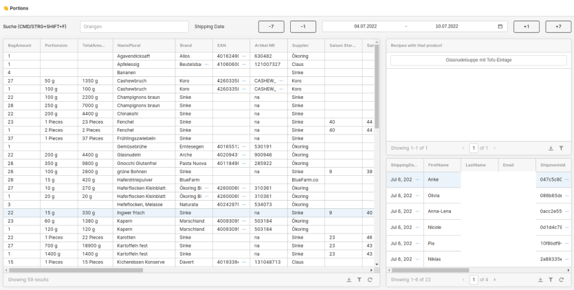
Even more interesting was the decision to use Retool as a back-office tool instead of building an admin interface ourselves. In addition to the mobile application itself, many apps require a web portal on which employees can perform administrative tasks. This includes classic user administration, support tasks, such as evaluating recipe feedback and problem reports with the box, or reading orders in production.
These administration portals can quickly become very extensive and represent a considerable development effort, but what many people don't know is that software already exists for building such generic portals, which saves 90% of the programming effort. With Retool, for example, you can click together the desired web interface incredibly quickly and implement the desired functionality with a little JavaScript and SQL.
A contrary but more effective development process
One thing we noticed in past projects was that the maintenance of various development environments (staging, integration, QA, ...) takes up too much time and nerves. Usually so much that the costs clearly outweigh the benefits. This also quickly makes the release cycle more complex and longer, so we took the opposite approach and dispensed with all additional (non-local) environments. And the result was better than we could have imagined at the beginning.
The performance boost we achieved as a result is best illustrated by taking a look at our (changed) development process:
From a pure front-end perspective, programming couldn't have been more enjoyable.
- 100% uptime - as development is carried out against production, the virtual environment never fails and if it does, this is resolved with the highest priority. One problem with non-production environments is often that they are not given a particularly high priority and a failure disrupts the work of front-end developers
- No version conflicts - When developing, you can always be sure that the interface is compatible. After all, Production always has the latest version
- The fact that you don't have to synchronize the data or fall back on mock data also makes development easier and leads to fewer bugs
The backend development was also uncomplicated. In order not to accidentally destroy the production database during development, each developer was given their own clone of the database. So it was easy to test with real data and bugs could be reproduced very quickly.
Our automated QA & release process was particularly interesting. After a new feature was developed and the associated pull request (a request to integrate the new code into the existing code base) was created and successfully reviewed, the new version was not first deployed on an integration environment and manually by QA -Engineers checked for errors, as is the case with most other software development companies. We ran automated tests that extensively tested the application for correctness and after these tests were successful, the new code version was immediately published in the Appstore / Playstore or on Azure. The average time from completion of a feature to release was reduced from weeks to minutes to hours. This not only ensured satisfied developers, but above all also satisfied customers and stakeholders.
In addition to the obvious advantages, there were many other positive aspects and learnings that unfortunately go beyond the scope of this customer story. If you want to find out more about Testing on Production, I recommend our blog article.
Note
Much of the information in this section may be difficult to understand for people who do not come from the IT sector. A detailed explanation of the terminology is unfortunately beyond the scope of this customer story. However, we are planning a more detailed explanation of our extraordinary development process in future blog articles.
The production
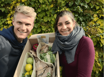
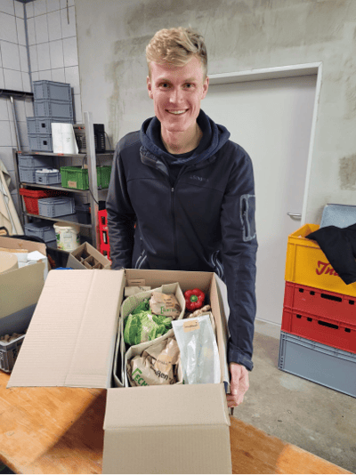
Without a cooking box, no cooking box. Somehow, and above all, somewhere, we had to store, pack and ship the food. Daniel's parents used to have a farm butcher's shop, where we were fortunate to be able to use the premises. Where there used to be minced bratwurst on the shelf, there were now carrots and cucumbers. Somehow that was a very nice sign of how transformation can be successful. The fact that the rooms had already been checked by the health department played into our hands.
Within a very short time, we were able to learn how to buy food efficiently, store it correctly, package it appropriately and ship it safely. The entire food supply chain.
In order to simplify the pick and pack process, we have built a very simple and efficient support system with Retool. Software - that's what we do 🙂
But we didn’t expect any other challenges. For example, we were very surprised and challenged
- How difficult it is to package food sustainably.
- How complicated it is to print shipping labels semi-automatically (on a small scale).
- How complicated it is to label food.
- How dependent the storage of vegetables is on input quality and weather.
- How time-consuming it can be to buy groceries and coordinate with all suppliers.
- How dealing with finished packages from delivery services causes our blood pressure to skyrocket. And much more….
On our very first day of production, it took the four of us almost 8 hours to finish the boxes. After a few months we managed 100 boxes together 💪.
After leaving the software, we suddenly became very active locally and regionally in business relationships in order to be able to realize all of this. We would particularly like to thank the Bioland Hof Sinke from Weinsfeld and the Ohne Laden in Hilpoltstein, who supported us so actively from the start in getting the food to the right place at the right time.
The creation of a fully functional online supermarket within 2 weeks
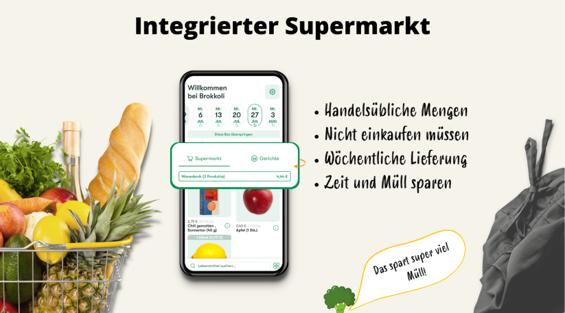
By far one of the coolest tasks for the development team was the development of the entire online supermarket. In contrast to remote work, we decided to do a 2-week hackathon in Croatia in order to complete this monster task in the shortest possible time. Since our first hackthon, in which we developed Broccoli's MVP, was already so successful, we were hopeful that we could replicate that success. And everything actually worked out the way we imagined. The team spirit and feature output could hardly have been higher during this time. Through first-class coordination and collaboration, we integrated a complete shopping system into the Broccoli app, which was previously only designed for a cooking box subscription model.
How do we think about and demonstrate the issue of sustainability?
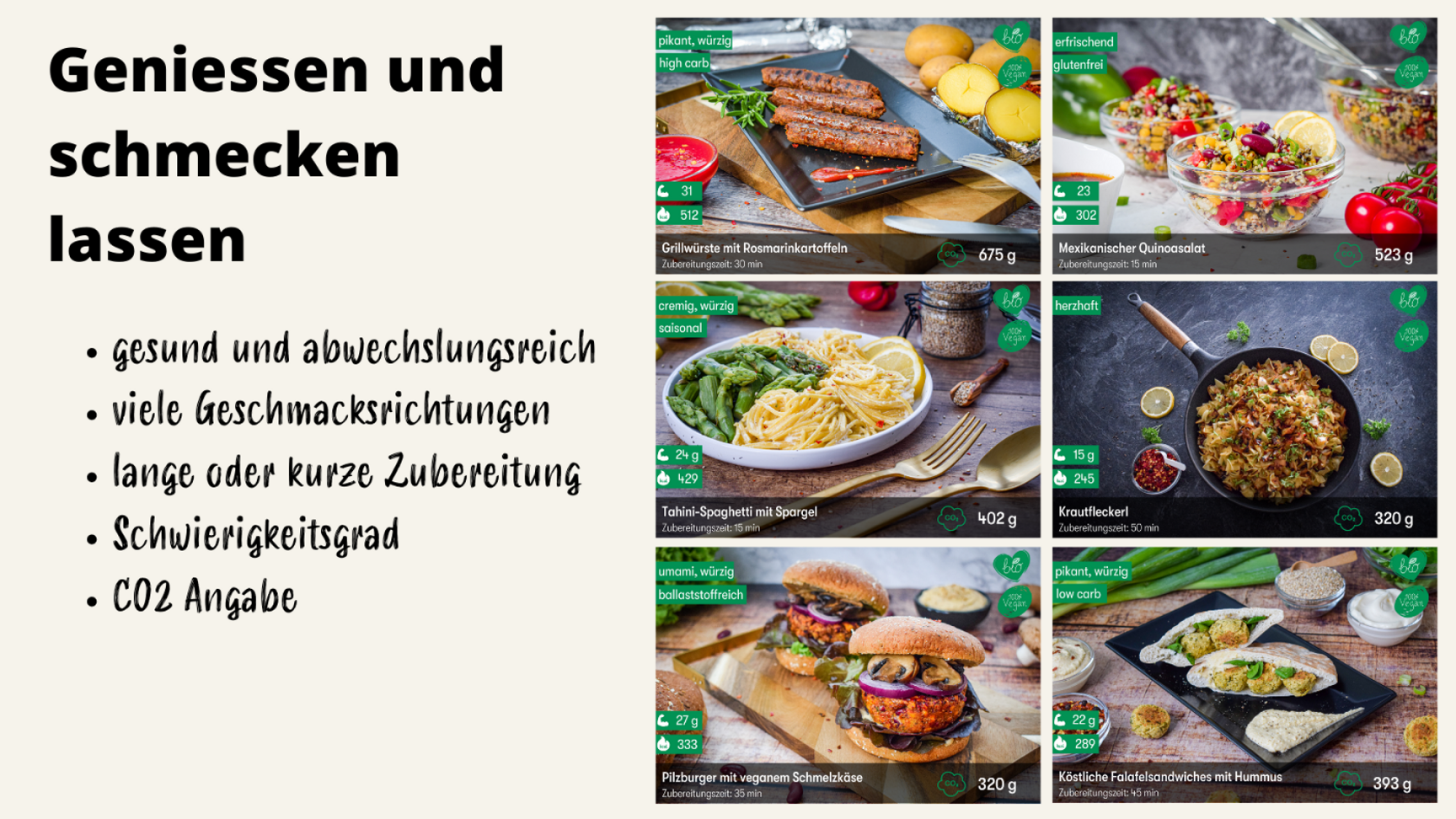
The vegan dishes to be cooked were based on a health plan. Wholesome nutrition (e.g. enough proteins) and the alternating offer of different taste types (fresh and light or would you rather umami and hearty?) were important to us. So we can say that eating broccoli is healthier and therefore more sustainable. The topic of organic is of course much more resource-efficient.
We will not go into detail here about the potential for saving CO2 through shortened food delivery routes or the approximately 20% reduction in food waste with meal kits.
What is worth mentioning, however, is how we have created a sustainability reference in the app. We were guided here by the study we conducted ourselves in our banking project (Study: Influencing factors for sustainable payment and investment behavior of Generation Y). Based on this, we started giving each dish not only nutritional information (relevant health tags for the user) but also a tag for the CO2 footprint of the court. With the CO2 tag, we would have been able to manifest reference and comparison values to users over time and thereby further increase awareness of nutrition.
Incidentally, company canteens like those of Audi AG already do this. Every meal in the canteen is labeled with CO2.
Outlook - Broccoli 1 year later
A year after starting Broccoli, we evaluated whether we had achieved the goals & KPIs we set for ourselves. Depending on this, we determined what a future for broccoli could look like.
Even though we and our customers were happy with broccoli, we realized that we probably wouldn't be able to become profitable in the near future. As software people, we somewhat underestimated the topic of food supply chains and BtoC customer acquisition. We also decided against external financing because, in our opinion, the product was not yet investor-ready. After carefully weighing up the risk and chances of success, we have decided to pause broccoli for an indefinite period of time.
Our core competence lies primarily in the software area 🙂
Nevertheless, we are proud of the results we were able to achieve in such a short time and, above all, of the many customers we made happy with broccoli.

“Absolutely awesome proooooddduuuukkkktt…. I mean dish 🫠😝😂 really great recipe.. thank you, you broaden my horizons so incredibly. Thank you very much for what you do with broccoli. I hope you get 1 million more new members. I’m happy to support you 🙏🏼🙌🏼”
Michael
with gratinated mac & cheese with vegan cheese sauce
“Cry out for more. 😋”
Andrew
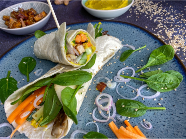
with hummus wrap with king oyster mushrooms and smoked tofu
“very very tasty!! and thank you for the many vegetables in this box 👍👍”
Miriam
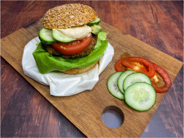
to Blackbeans Double Burger
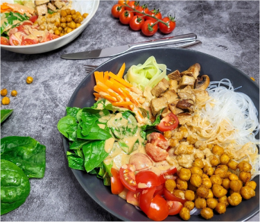
"Delicious. But way too much for two people (at least for us). Half would have been enough for us. But we still have something for tomorrow :-)"
Sandra
with Buddha Bowl with sesame sauce
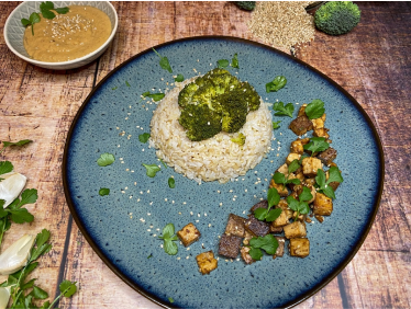
“great, thank you very much 🙏🏼”
Michael
with cashew vegetable stir-fry with rice

“my favorite broccoli meal 😋”
Sonya
Oven sweet potatoes
Do you want to collaborate with us?
Ready to start your Journey
Move Parallel with us. Achieve your goals by consistently getting our latest updates. Always keep an eye on what we are doing by subscribing to our newsletter.